Typography

Typography

Typography

Fonts

All communication and creatives use only two fonts: EIL Serif and EIL Sans Serif (based off of Gotham).

Aa Bb Cc Dd Ee Ff Gg Hh Ii Jj Kk Ll Mm Nn Oo Pp Qq Rr Ss Tt Uu Vv Ww Xx Yy Zz 1 2 3 4 5 6 7 8 9 0 ? ! @ # $ % &

EIL Sans

Aa Bb Cc Dd Ee Ff Gg Hh Ii Jj Kk Ll Mm Nn Oo Pp Qq Rr Ss Tt Uu Vv Ww Xx Yy Zz 1 2 3 4 5 6 7 8 9 0 ? ! @ # $ % &

EIL Serif
EIL Sans LightEIL Sans BookEIL Sans BoldGothamEIL SerifEIL Bold

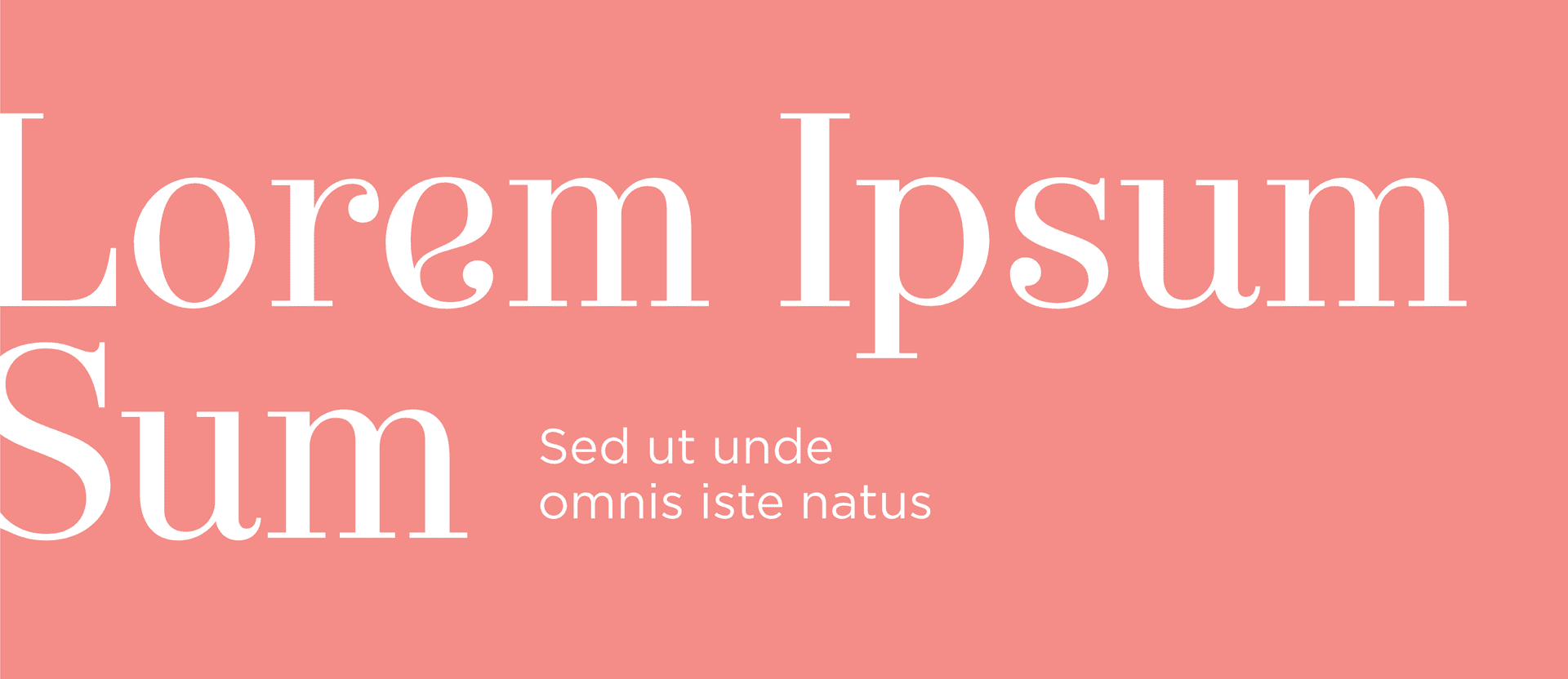
Most creative work and communication will use EIL Sans. EIL Serif is to be used selectively, in low volume and large scale only. It may be used for level 1 titles, to accentuate names or as decorative type. It is never used in all UPPERCASE.


Styles

The below are a series of suggested styles of typography. They are not exhaustive. Nor should all designs use all these styles at once. Combine a minimum of styles to maximise communication hierarchy.

Top title This is usually used as a top level title, never more than once in a single creative. Make not of relatively tight tracking and leading on these fonts. Secondary title Tertiary title Always in uppercase. Leading or subtitle text usually running over two or more lines This is one of the rare uses of the ‘light’ version of EIL Sans. Used under top level titles, or before main body text in documents and written digital communication. It is intended to contain the main message of the proceeding paragraphs.

Banded Text

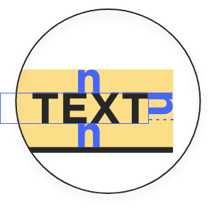
Band Settings

Used in a variety of colours, but always the same style, height, and black underline; only with EIL Sans Bold. This is a style used either for titles or for links (digital) that are ‘invitations’ to discover other pages. Make special note of the spacing around the text, which defines the size of the ‘band’. Also note that the ‘underline’ is strictly the thickness of the letter I in EIL Sans Bold at the given size.

Body text always uses EIL Sans Book. Do not set body entirely in bold text, although it may be used to highlight content. Also do not set any body text in Light, it is illisible. In terms of text decoration, you may used underline, or strikethrough. Italics is not used.

Make note of the proportion between font size and leading: 1:1.5 is the minimum ratio. Also note that for large blocks of text (50+ words), we always maintain width to have 10-12 words a line.
“” Note that quote marks are always displayed in EIL Serif, although the quote itself is not.

Compositions

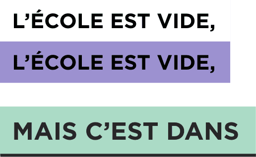
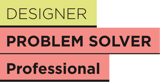
The below are some examples of how composition is used to make titles with the EIL typography. Please make special note of permitted colour use (only bands, not text), of the use of EIL Sans Bold uppercase, selective used of EIL Serif, equidistant spacing around text in bands, and weight of ‘stroke’ or ‘underline’.

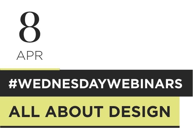
Here are some examples of banded compositions
Band Settings

Occasional use of EIL Serif for large typeWhite bands, when followed by a black, are the only ones which can take a coloured underline.Multiple bands can be stacked together to create hierarchy. But they must all be ‘stuck’ to each other.

Band Settings

Text is ONLY ever in EIL Black or white, whichever maximises contrast with the background.

Band Settings

EIL Black or white bands may be used without underline.Coloured bands MUST have an underline in EIL Black. Each ‘composition’ may use only 1 colour in addition to EIL Black and white.

Band Settings

Bands may be scaled and ordered as to create hierarchy. However, refrain from having more than 3 band heights.EIL Serif is not in uppercase.

Here are some composiitons mistakes you should avoid

Band Settings

Coloured underlines on non-white bands.Coloured text

Band Settings

2 rows of bands at exactly the same width. Rework the word break in this case. There should be a visible difference in width. Also avoid ‘small’ differences that look like an error.A single block that has a break between bands. Bands must be stuck together.

Band Settings

ANY sort of asymmetric application of the bands behind text. There are some versions of this that are obviously off (such as on the left). That said all symmetry is not metric (measured). You are likely to find that, especially at smaller scales, for it to appear to be symmetric, the top and bottom padding is different from the left and right. Use your best judgement, but ensure that it is visually symmetric.

Band Settings

Run on text — these are not bands for paragraphs, but per line. Width should be applied per line, underline should be applied per line. There is never run on.

Band Settings

EIL Sans Book or LightMultiple colours in 1 compositionToo thin/thick underlinesLowercase EIL Sans type